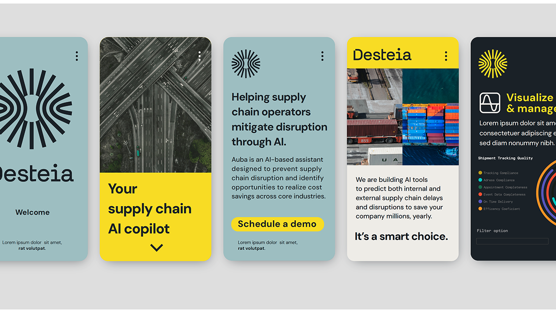
Welcome to my portfolio piece showcasing a side-by-side comparison of two design approaches for a fintech app:
Material 3 and the bold new Material 3 Expressive. In this project, I reinterpret the same app by applying two distinct visual languages. With Material 3, the focus is on subtlety—using soft shadows, integrated color cues, and dimensional gradients to create a clean, light interface. In contrast, Material 3 Expressive pushes design boundaries with contrast-driven elevation, dynamic movement, and bold shapes that make the interface pop.
This exploration emphasizes how nuanced changes in design elements can dramatically alter user experience and brand perception.
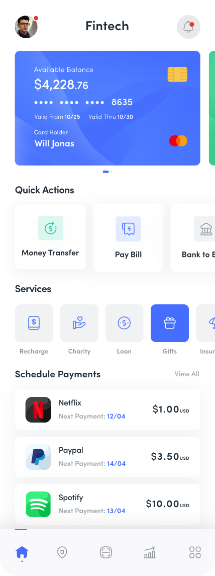
Material 3
Elevation:
Utilizes shadows to create a subtle sense of depth
Utilizes shadows to create a subtle sense of depth
Overall Aesthetic:
Clean, light, and minimalist
Color Cues & Palettes:
Relies on integrated, subtle color cues
Clean, light, and minimalist
Color Cues & Palettes:
Relies on integrated, subtle color cues
Dimensional Effects:
Uses gradients to add depth and a layered feel
Uses gradients to add depth and a layered feel
Typography & Icons:
Standard, minimalist numbers and icons
Standard, minimalist numbers and icons
Interaction & Movement:
More static elements focused on clarity
More static elements focused on clarity
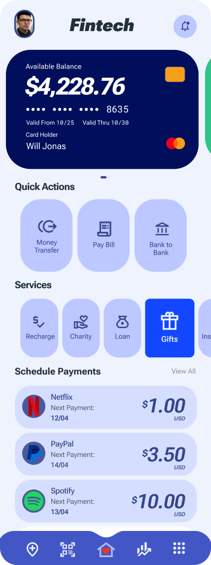
Material 3 Expresive
Elevation:
Employs contrast to emphasize elevation
Employs contrast to emphasize elevation
Overall Aesthetic:
Bold, stylish, and vibrant
Color Cues & Palettes:
Features duo color palettes for impactful visuals
Bold, stylish, and vibrant
Color Cues & Palettes:
Features duo color palettes for impactful visuals
Dimensional Effects:
Focuses on shapes and dynamic movement instead of gradients
Focuses on shapes and dynamic movement instead of gradients
Typography & Icons:
Bold and expressive numbers and icons
Bold and expressive numbers and icons
Interaction & Movement:
Incorporates movement to emphasize actions
Incorporates movement to emphasize actions