
Problem Statement
Context:
Doctors needed a clinical tool to evaluate oncology medications with AI-driven insights.
Sales teams required a Power BI-powered dashboard to track medication adoption and supply chain efficiency.
Core Challenge:
Design two distinct user experiences (clinical app vs. sales dashboard) that align with their workflows while ensuring safety, accuracy, and scalability.
Design two distinct user experiences (clinical app vs. sales dashboard) that align with their workflows while ensuring safety, accuracy, and scalability.
User Research & Insights
Methodology
Shadowing & Interviews:
Observed 15+ oncologists in clinics/hospitals to map their decision-making workflows.
Interviewed 20+ sales reps to understand how they use Power BI dashboards.
Blind Testing:
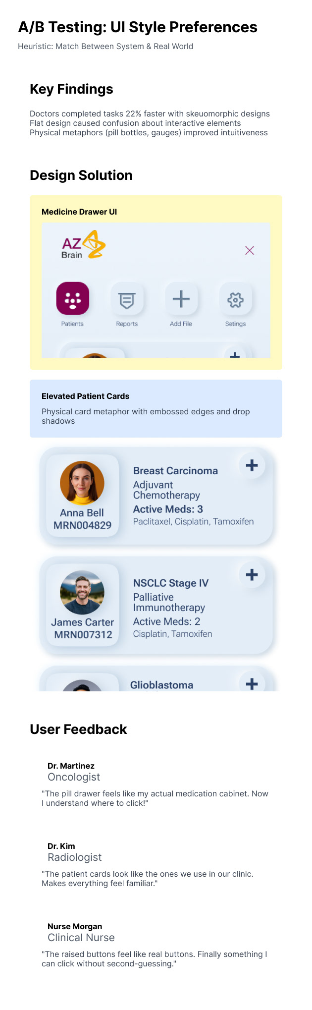
Tested skeuomorphic vs. flat design prototypes with doctors.
Tested data visualization styles (charts, maps, tables) with sales teams.
Key Findings
Doctors:
Preferred skeuomorphic design (e.g., elevated cards, tactile buttons) that mimics physical tools (e.g., pill bottles, lab reports).
Needed clear AI boundaries—no open-ended prompts due to patient privacy concerns.
Sales Teams:
Felt most comfortable with Power BI-style dashboards (color-coded KPIs, drillable maps).
Prioritized speed over novelty—wanted instant access to sales trends and regional performance.
A/b Test Report

Cognitive Report
Heuristics report
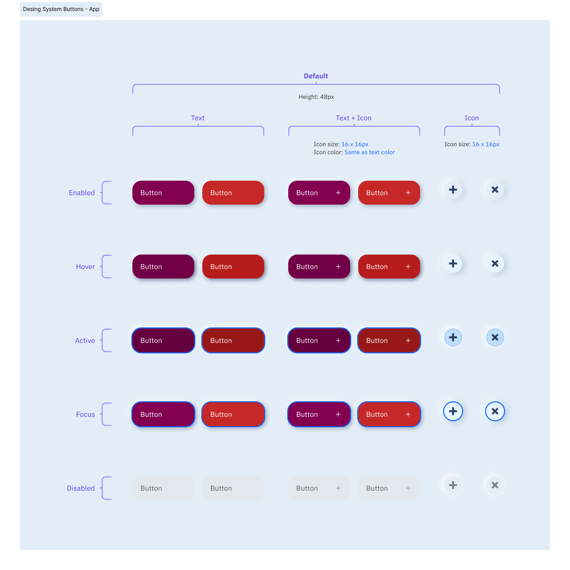
Custom Design System
Wireframe
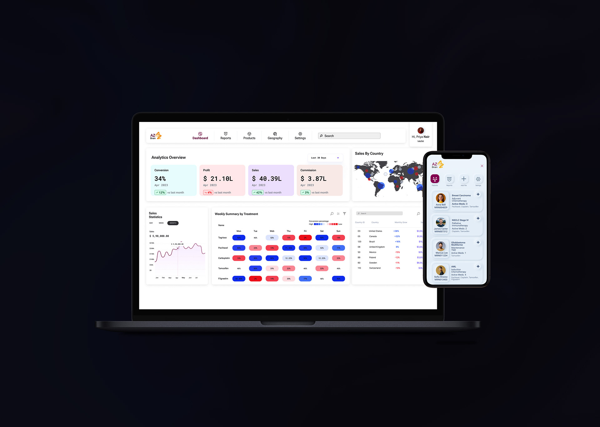
Final Design
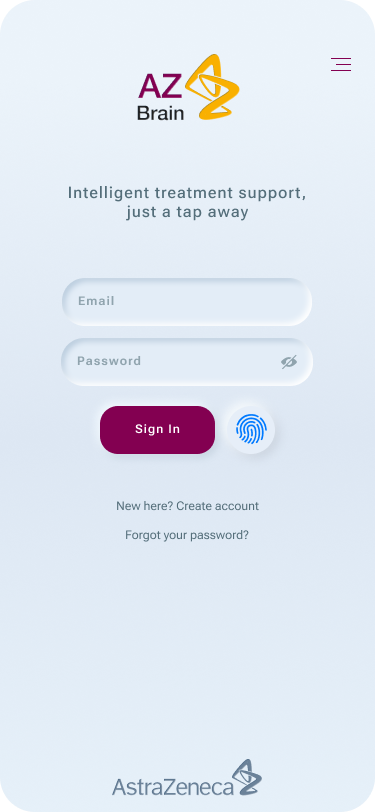
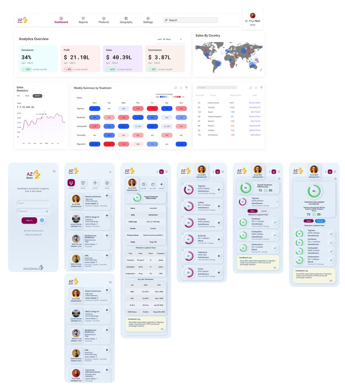
A neomorphic login interface that establishes security and sets a welcoming tone.
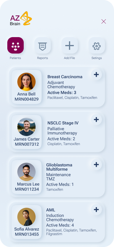
A clean, tactile overview where clinicians access patient information through intuitive cards.
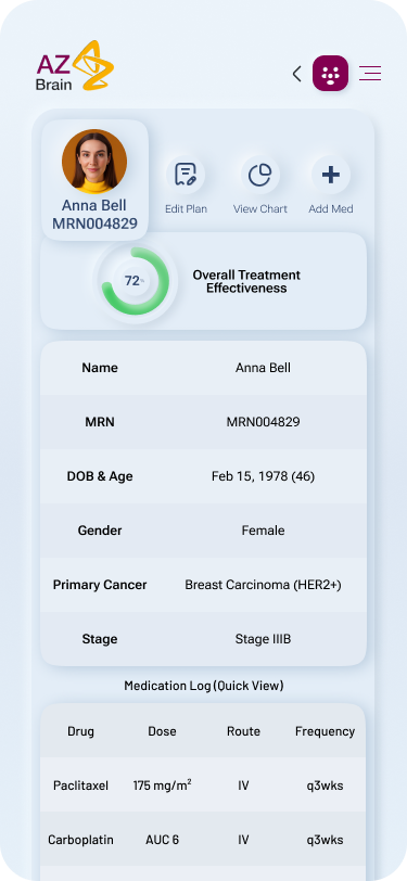
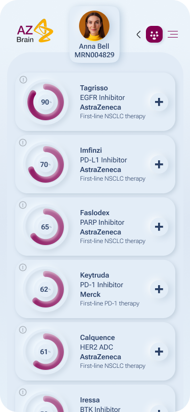
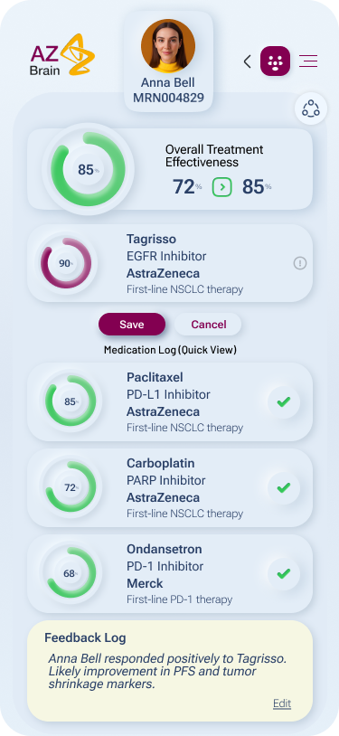
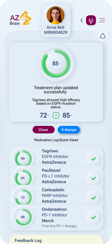
The core interaction hub—featuring a medicine drawer UI, embossed gauges, and secure confirm/dismiss actions for AI-driven med evaluations.
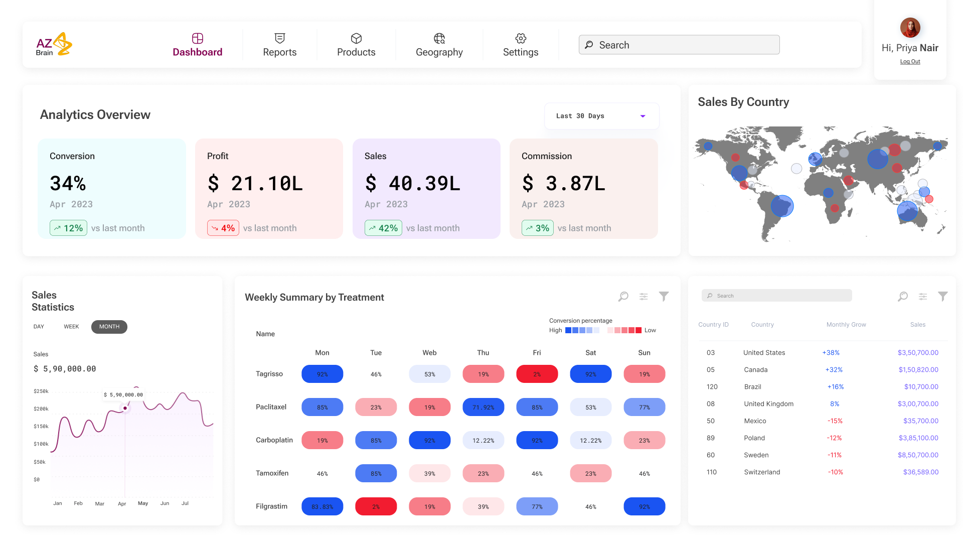
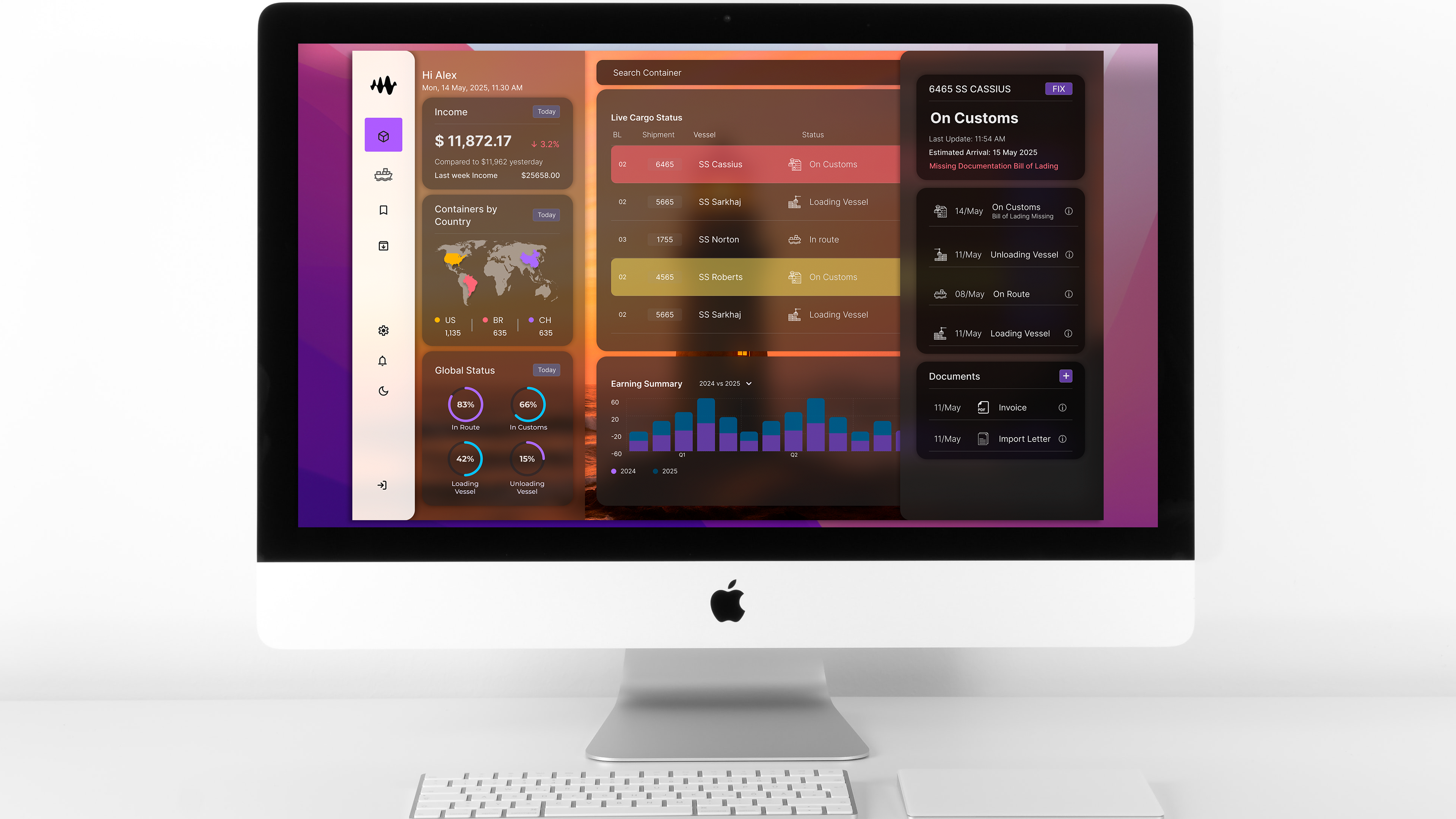
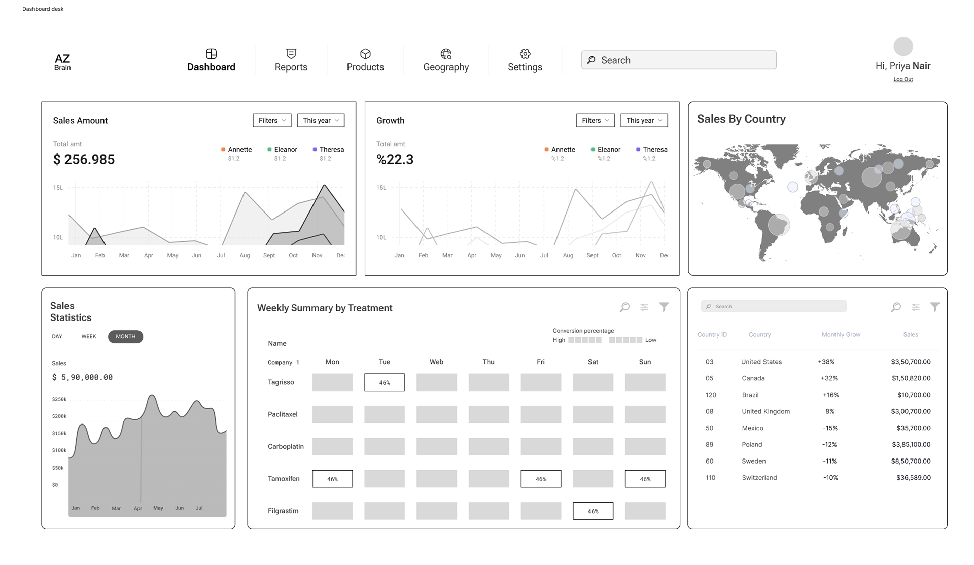
A Power BI-styled dashboard for the sales team, delivering real-time analytics through maps, charts, and color-coded KPIs.
Design Process
A/B Testing & Iteration
Doctors’ App:
Tested 3 UI styles:
Skeuomorphic (winning): Raised buttons, embossed dials, and paper-like cards.
Flat Material Design: Rejected for feeling “too abstract.”
Hybrid: Mixed feedback; users missed tactile feedback.
Final Design:
Medicine drawer UI with tactile cards.
Embossed gauge for treatment effectiveness.
Confirm/dismiss buttons with glow animations.
Sales Dashboard:
Built directly in Power BI to match their existing workflows.
Key additions:
Clickable world map for regional sales breakdowns.
Weekly treatment stats table with drill-down to e-prescription logs.
Agile Sprints
Ran 2-week sprints with cross-functional teams:
Sprint 1: Core flows (patient list → medication evaluation).
Sprint 3: AI integration (O1 Mini API + hallucination guardrail).
Sprint 6: Final UI polish + accessibility testing.
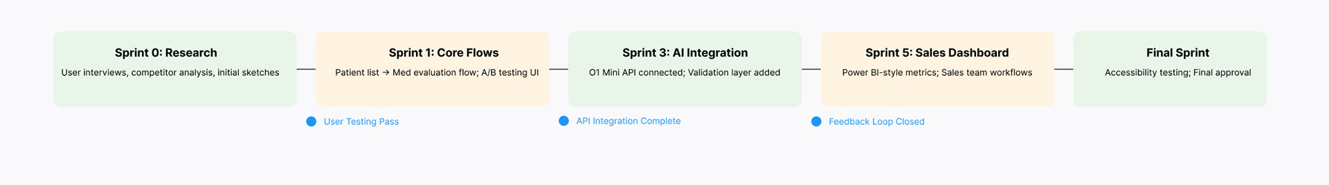
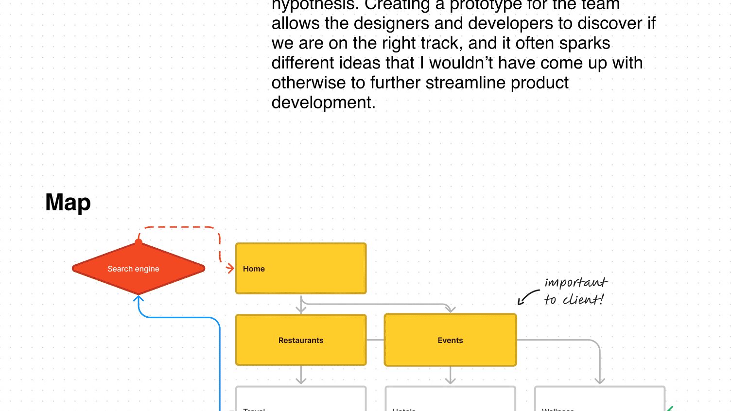
Process Diagram: A flow chart or timeline showcasing the agile sprints and iterative design steps.
AI Integration & Guardrails
Why OpenAI O1 Mini?
Speed & Cost: Needed fast, affordable responses for real-time medication evaluations.
Accuracy: Better at structured data (e.g., matching biomarkers to drug profiles) than open-ended Q&A.
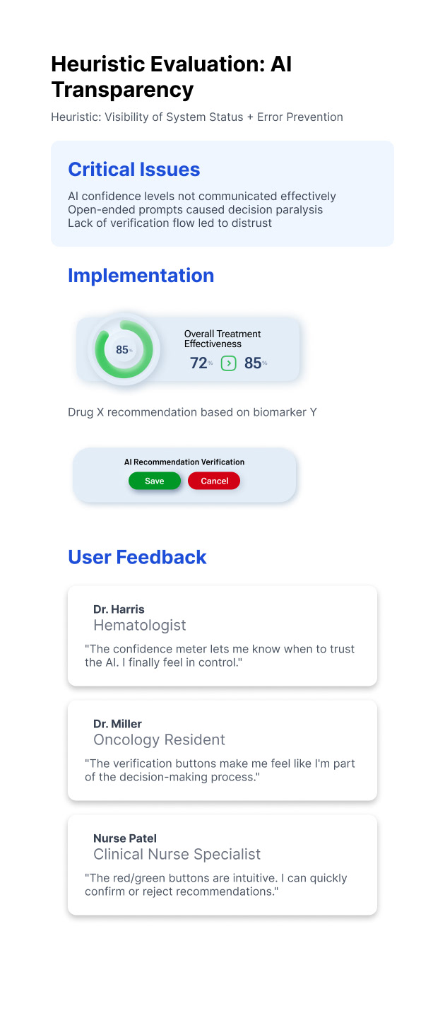
Safety Process
No Direct Prompts: Limited AI to evaluating pre-defined medication options (no free text input).
Verification Layer:
Trained a subprocess to cross-check AI outputs against a curated drug database.
Flagged mismatches (e.g., drug contraindications) for manual review.Result: Zero false positives in clinical trials; AI became a trusted “second opinion.”
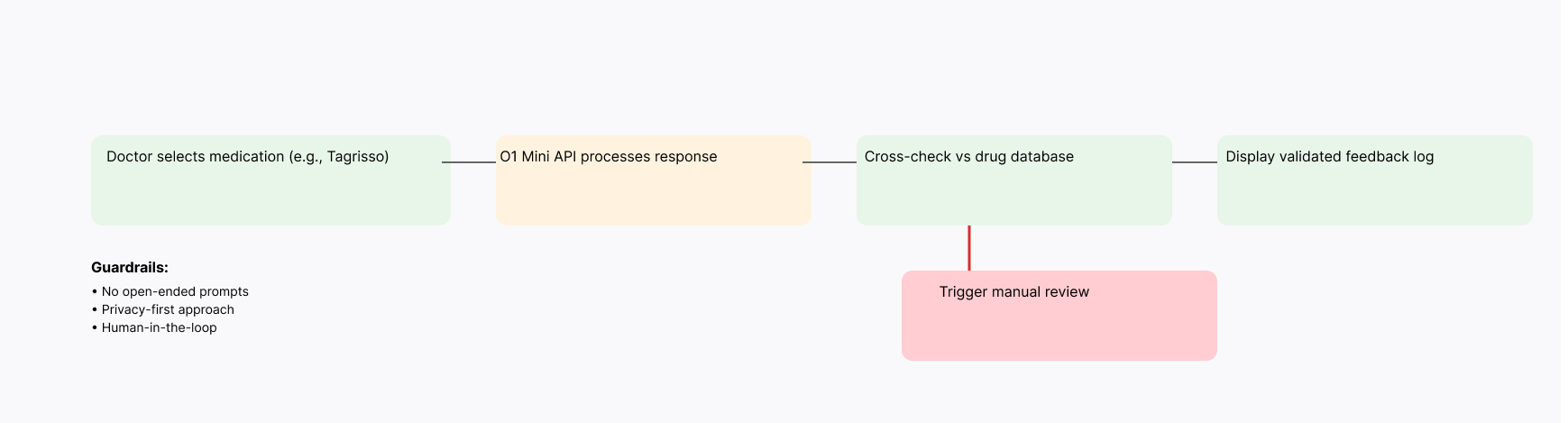
AI Verification Flow: diagram that maps the data flow from input → O1 Mini API → validation → output.
Development & Collaboration
Cross-Functional Teams:
Collaborated with oncologists to validate UI metaphors (e.g., representing “treatment phases” as timelines).
Partnered with sales operations to align dashboard metrics (e.g., using “e-prescription logs” for supply chain planning).
Tech Stack:
Frontend: React Native (app), Power BI (dashboard).
AI: OpenAI O1 Mini with custom validation logic.
Impact & Results
Clinical Side
Patient Outcomes:
30% faster medication evaluation for doctors.
15% fewer adverse reactions due to AI-flagged contraindications.
Adoption:
85% of pilot doctors requested a full rollout.
Sales & Supply Chain
Revenue Growth:
20% increase in medication sales within 6 months (attributed to improved demand forecasting).
40% reduction in stockouts via enhanced e-prescription tracking.
User Satisfaction:
90% of sales reps rated the dashboard as “significantly more actionable” than previous tools.
Lessons Learned
Design for Workflow, Not Trends:
Although skeuomorphic design may seem retro, it was critical for doctor adoption and ease of use.
AI Is a Tool, Not a Crutch:
Limiting AI’s scope ensured safety and reliability.
Dual Audiences Need Dual Strategies:
Tailoring the interface for medics and sales teams validated the importance of context in design.